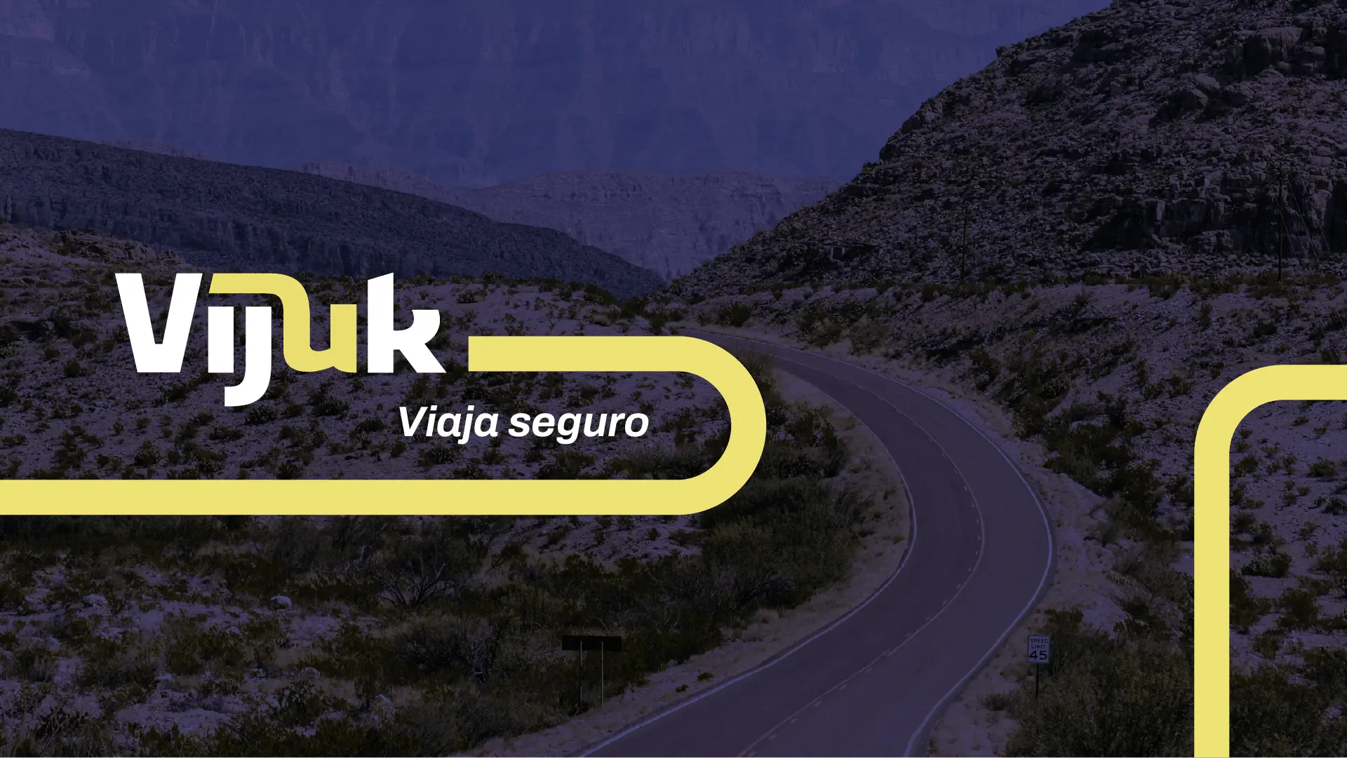
Typographic logo for Vijuk
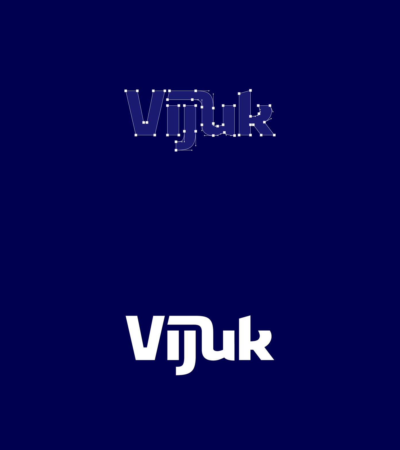
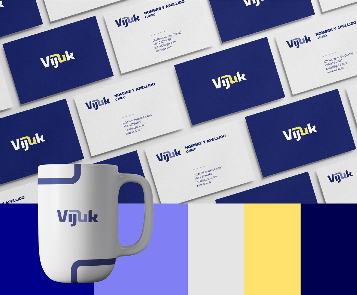
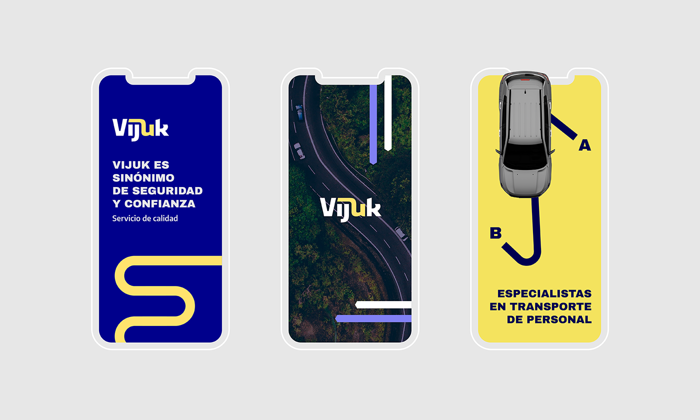
Hey graphic design agency has developed a typographic logo for the personnel transport company Vijuk. The work contemplates the selection and modification of different typographic fonts to generate a unique piece tailored to the client’s needs.
Vijuk is a personnel transportation company with special focus on the regions of Chile. The typographic logo plays with the characters to generate the feeling of connection, roads and routes. This visual composition reflects the importance attributed to punctuality in each route, underlining that safety is the top priority. The thickness of the typography communicates a sense of solidity and commitment, while the unified arrangement of the letters concretely merges the concepts of safety, punctuality and commitment in a cohesive block.

